Vindara Health
We worked with Vindara Health — a company dedicated to making complex-illness treatment more accessible to all — to bring their brand and website to life. We guided them through a full brand launch, creating a visual identity built on trust, care, and specialised knowledge.
Project overview
Project type
Branding
What we did
Brand Strategy & Positioning
Logo & Brand System
Brand Guidelines
Iconography
Photography Style
Website Design & Development
Model / Company size
B2C / Early stage start-up
Making specialised care accessible to patients with complex chronic illnesses.
Vindara Health is the pioneering, science-driven specialist clinic dedicated to treating complex post-viral illnesses like Long COVID and ME/CFS with the rigour and respect they deserve.
Our collaboration with Vindara Health encompassed everything from strategy and brand positioning to defining their visual identity and communication style. This foundation influenced every aspect of our efforts to bring their vision to life through a comprehensive brand system.
The central concept of our work was metamorphosis. Vindara Health does not offer a one-size-fits-all treatment. Instead, they guide each patient through their own unique transformation, and the brand needed to honour that. Every decision, from the identity system and typography to photography direction and brand guidelines, was made to create a brand that feels both credible and human.


Our approach
A brand built around transformation and support
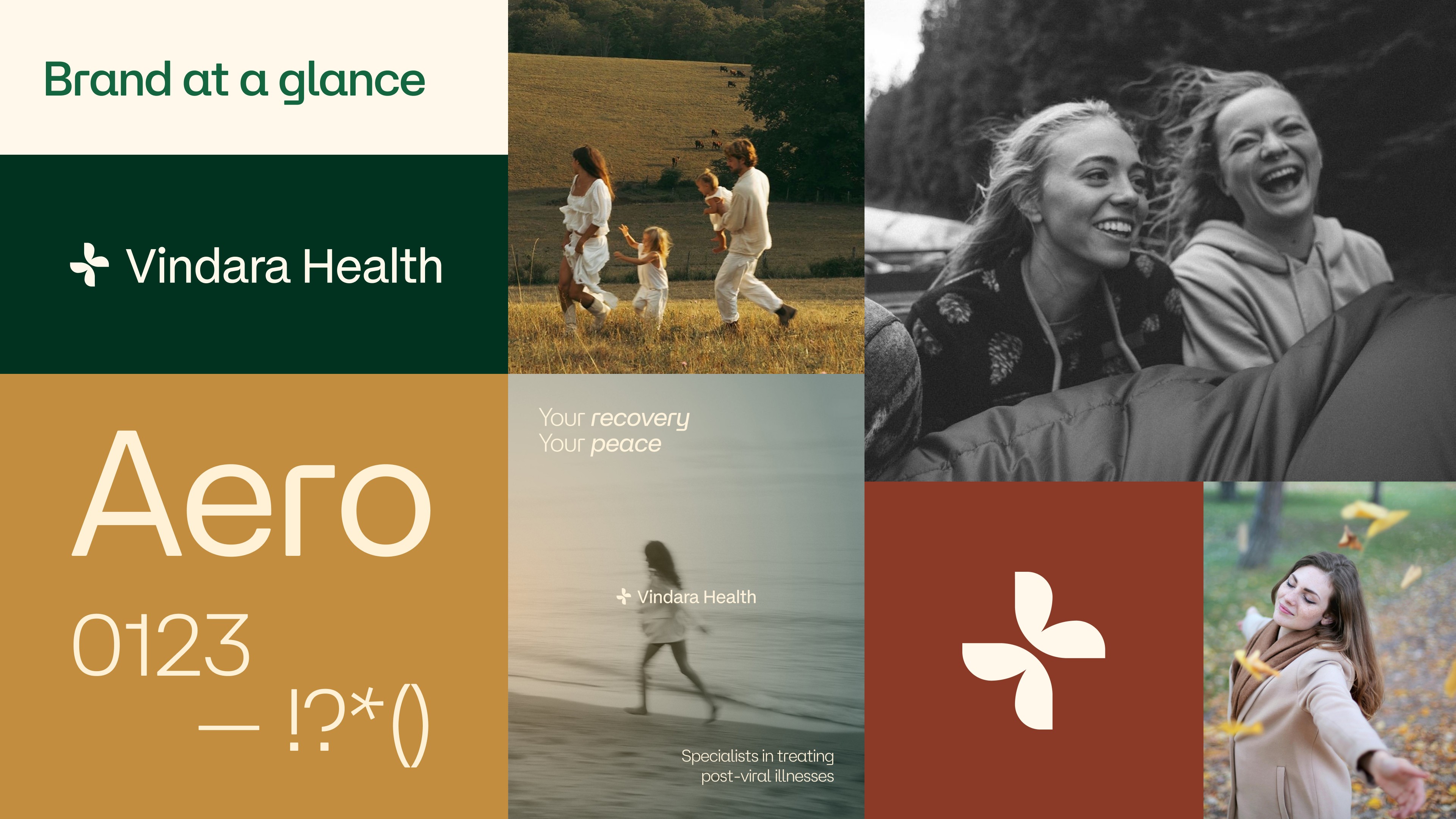
Metamorphosis is the at the heart of the brand’s story, where patients can finally reclaim their lives with the right support. This became the identity’s core: from the four-petal symbol that quietly nods to a butterfly in motion, to a tone of voice that speaks to patients as partners, not passive recipients of care.
Accessible specialised care that scales with patients
Vindara Health’s ambition is to make specialised care accessible to everyone who needs it, regardless of where they are. The brand was built to carry that ambition. A flexible system that works across every touchpoint. Warm enough to feel personal and robust enough to grow.
Where science-backed credibility meets compassion
The main goal was to earn patients’ trust by being 100% science-backed, but never cold or clinical. Every design decision was made with that tension in mind: a palette rooted in deep, grounded greens and warm earthy tones, an identity system that is structured and precise, but always human at its core.