November 11th, 2024
11min read

Creating a design system from scratch isn’t simple. It can often be overwhelming and time-consuming, but when done right, it will save you time and increase efficiency and consistency for both designers and developers.
Below, I describe my process of building a design system from the ground up, leveraging the atomic design principle. This methodology allowed me to roll out high-quality UI faster and more efficiently by following a hierarchical system that goes from creating the core components all the way to high-fidelity pages.
In summary, this design system has five main building blocks, which are:
Efficiency and consistency are the main benefits of having this structure in place, meaning I was able to create new pages within minutes! All I had to do was choose a template, input content, add graphics or iconography (when needed), and ta-da! The job was done!
Updating a component was also simple and easy because changes cascaded down to all locations where that button was applied, killing the dull manual labour of updating it one by one.
Now that we know the main advantages, let’s dive into each building block.
1. Foundation: the design system core
As the name suggests, the foundation is where everything begins. Before I jumped into layouts and wireframes, I defined all core elements, such as the colour palette, typography, iconography, and grid system. This initial work was essential to remove the guesswork later in the process and to facilitate the hand-off stage.
1.1. Colour palette
By far, this was my favourite part of the whole process. The colour palette sets the tone of the entire UI, as it is one of the most vital elements of the brand identity. The brand guidelines highly influenced the colours picked for this design system. Still, green and grey were added to use them primarily as feedback colours. All hues and shades were thoroughly tested for accessibility* and compatibility.
Most of the UI was designed using primary colours — they were applied to text, buttons, and most components. However, secondary colours were applied with care to iconography and other design elements to bring a pop of colour to the overall design and help structure the page for easier readability.
* WCAG 2.0 recommends a minimum contrast ratio of 4.5:1 or AA. Shades that are outside this range should not be used on text.
Royal Blue is the primary brand colour applied consistently throughout the website. Orange and Yellow complement the primary colour palette and are both accent and feedback colours. Green is solely a feedback colour, but sometimes, it can be applied to tags when an extra hue is needed. Purple, Pink, and Grey are secondary accent colours applied mostly to tags, iconography, and illustration.
1.2. Typography
When defining a type scale, my two main goals were legibility and harmony. I considered the baseline grid to set the leading — both multiples of 4px — to establish a vertical rhythm.
The deliberate choice of 2 font families was made to create contrast. Aller, a perfect display font, was ideal for titles and main headings, while Effra, a humanist sans-serif, was carefully selected for body text and long-form content.
To communicate hierarchy, I implemented 12 font sizes — 6 display and 6 body text sizes — and 3 weights for each of them — regular, italic, and bold.

1.3. Iconography
Just like typography, legibility was the most important factor in defining icon style and size. The primary icon size was set to 24px. Small 16px icons were applied to mobile navigation, buttons, and dropdown menus. Finally, the large 48px size was solely used for illustrative purposes, such as cards and graphics.
Shown here is the 24px primary icon size with and without background colour. The background colour variation was applied when more contrast was needed.
1.4. Grid system
It goes without saying that grids are one of the foundational structures of any interface. Defining a layout and spacing system helps designers visualise and organise elements on a page. More importantly, a design that follows a systemic grid improves user experience by enhancing readability, clarifying information architecture, and providing a framework for responsive design.
I set the baseline grid to 4px, meaning all increments were divisible by 4. The layout was constructed using a 4px, 8px, 16px, and 32px increment system. The larger the space, the bigger the increment.
Layout and spacing scale. On desktops, all important content was contained within a 1216px area. On mobile, the minimum width was set to 328px to allow for a 24px margin on each side.
2. Base components: setting the layout scene
Once the foundation was defined, it was time to build the UI base components. Buttons, tags, and form inputs are examples of base components and they serve as a baseline for all your other main components.
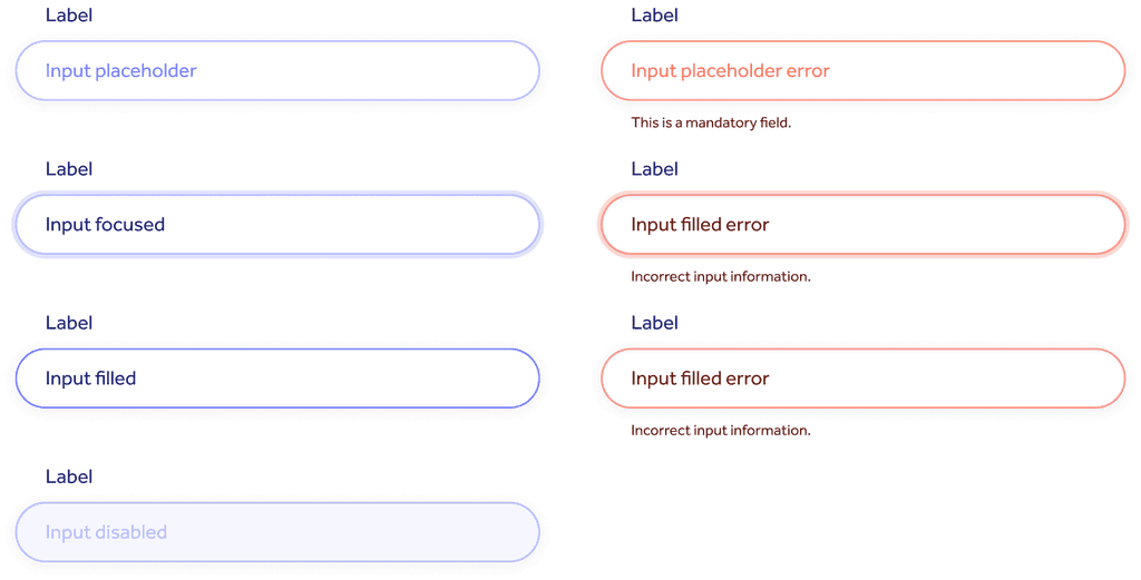
During this stage of the process, I also created all variants needed for user feedback, such as active, hover, and disabled states for buttons and default/error states for form inputs.
Defining variants speeds up the design process and informs developers about how components should behave when users interact with them.
Primary buttons were designated to main CTAs. The colour applied would depend on the background, as high contrast was needed. Outline buttons were applied on pages where a secondary CTA was required. Links were largely used on cards where the link itself wasn’t the primary information.
Tags were heavily used on pages where content needed to be categorised and filtered, such as blog, resources, case studies, and events.
Feedback variants created for form inputs. For both default and error variants there’s a resting, focus, active, and disabled states.
3. Main components: unveiling the layout structure
Once the base components were in place, I could then define the main components. At this stage, the layout structure starts to be unveiled, and objects that will soon make up modules and pages are created.
The main components were heavily used across the entire UI, so making them available in the design system as single objects was essential to speed up the design process. Good examples are the website navigation and footer, forms for data collection, cards, and CTA banners.
The navigation is where we organise and present the core website structure, or IA (Information Architecture). All the main pages are linked here for easy access.
Full-width cards (top) were used to highlight upcoming events or featured articles. The 1/3-width cards (bottom) were used to summarise/highlight content or list blog articles and events.
The long-format form (left) was primarily used on high-intent pages, such as “Book a demo” or “Contact sales.” The sidebar form (right) was heavily used across blog articles to capture users’ data on low-intent pages.
4. Modules: shaping up layout and pages
Modules are fully developed components that ultimately make up templates and pages. The main benefit of developing modules is consistency. The magic of “drag-and-drop” happens here! Once modules are in place, creating pages becomes second nature — an easy, efficient, and seamless experience.
4.1. Hero section
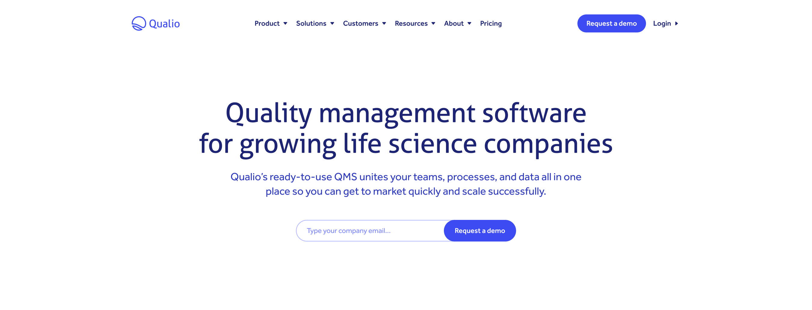
Below are some examples of modules used on hero sections. I established a couple of core styles that were all lightly customisable.
For main pages, including the home page, a short-format form was added to allow users to book a demo right away. I incorporated an eyebrow title on product and solution pages to help users identify the page name. There was an option to include a primary and a secondary CTA. Icons, images, or graphics were added for context on pages where the product wasn’t the main focus.
4.2. Cards
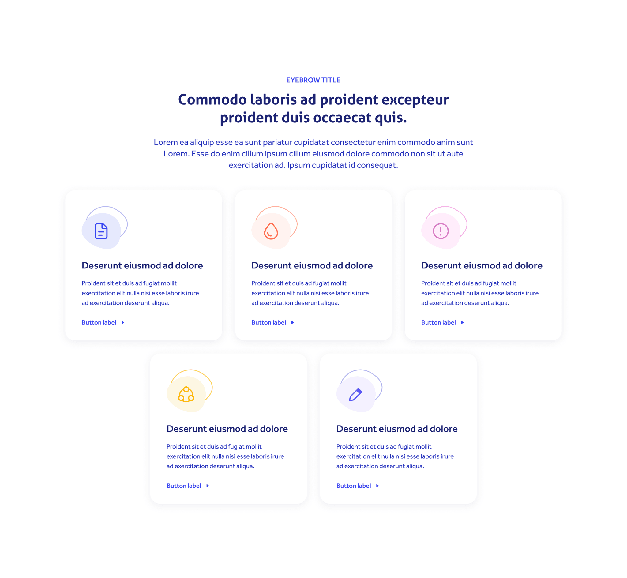
Cards were one of the main components of the website and were used for various applications. They were ideal for listing resources and articles and promoting webinars and events. They were also helpful for highlighting information or linking content between pages.
5. Templates & pages: the final step!
The final stage was also the easiest one! With all the puzzle pieces in place, assembling templates was a no-brainer!
Remember, templates are the backbone of the website. They will define the layout structure and set the tone, so it’s crucial to capture a variety of scenarios and implement guidelines on how to best leverage them.
Find the sweet spot! Don’t create too many templates, which will cause confusion and ultimately slow down the entire process. For this design system, 4 was the ideal number:
Default template: used to build several main pages, including company, careers, product, and solutions overview. Since modules were interchangeable, I could replace them without losing the main structure.
Content-dense template with images: applied to all product and solution inner pages.
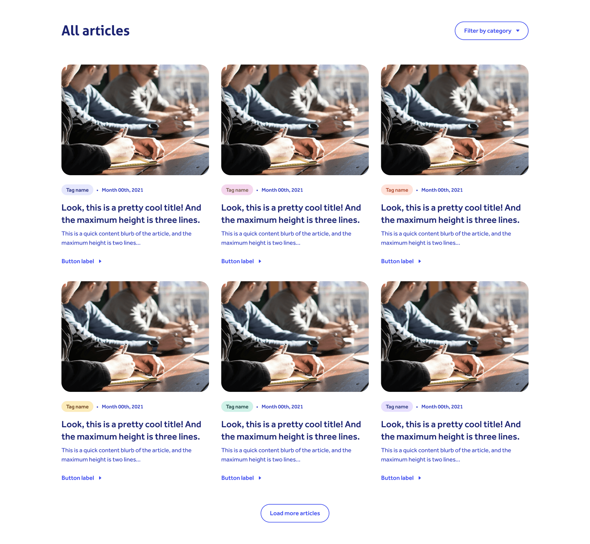
Article listing template with dropdown filter: ideal for resources, events, webinars, blogs and customer case studies.Demo template with a lighter header/footer and a long-format form to capture user data.
The entire website was built using these 4 main templates, however, during the design process, I would replace the modules accordingly and input content and assets as needed.
You can explore the layout below by navigating the live website!
Evolving it over time
This design system has been in place for 3 years, and just like any other scalable system, it has evolved and adapted over time. Change, however, isn’t a problem because everything is done at source, and updates cascade down smoothly as they should.
This work was initially designated for marketing purposes only (the website) but most recently also served as a baseline for the product design system and overall product development.
Bottom line: there is a lot of value in building a scalable design system!


